.png)

Much Ado About Colour : Pantone’s Decision to make White the Color for 2026 is causing a meltdown. And we wonder why.
- Mercy Edmund Harold
- Dec 8, 2025
- 2 min read

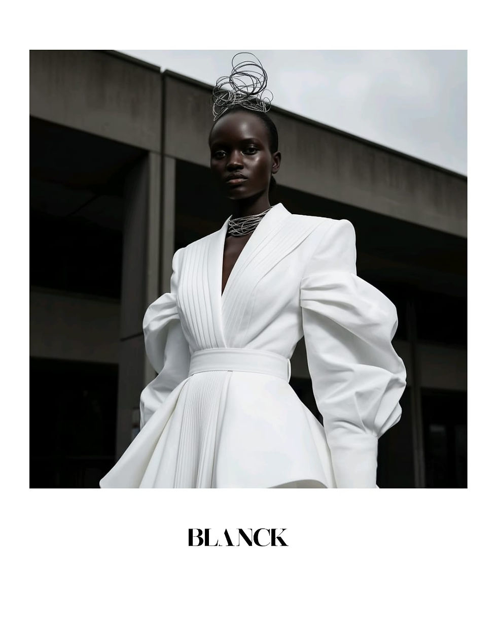
Pantone’s decision to crown white as the Colour of the Year for 2026 has landed fashion in the middle of a creative debate. Traditionally associated with purity, minimalism, and luxury, white has long been a runway staple, from crisp tailoring and bridal references to sculptural couture and pared-back luxury basics. But as a global statement colour, its selection feels deliberately restrained.

To understand why this choice has triggered such intense reaction, it’s important to understand who Pantone is and why their decisions carry weight. The Pantone Color Institute is a global authority on colour communication and trend forecasting, best known for its Pantone Matching System (PMS), which standardises colour across fashion, beauty, interiors, printing, and product design.
Each year, its Colour of the Year is selected after months of cultural research spanning art, politics, technology, economics, travel, and social behaviour. The result is positioned not just as a trend, but as a reflection of the global mood—setting a visual and emotional tone that filters into branding, retail, luxury collections, and mass consumer culture worldwide.

Supporters of the choice see white as a powerful reset. After seasons dominated by sensory overload, micro-trends, and hyper-consumption, white offers simplicity, craftsmanship, and a return to form. It supports the continuation of quiet luxury, where silhouette, fabric, and construction take precedence over spectacle. In this context, white becomes a canvas for refinement rather than excess.

Much ado about colour, indeed. Personally, I don’t like nor wear white. The fear of makeup transferring onto glaring white fabrics keeps me humble, and far away from it.
But I’ve also seen people who truly relish white, who wear it with confidence, ease, and a kind of quiet authority. And designers, too, have long understood its power. Adebayo Oke-Lawal of Orange Culture, for instance, was clearly ahead of his time, leaning heavily into white in his latest 2026 collection with intention, softness, and emotional weight.
In that context, the backlash feels surprising. If designers have already been exploring white with meaning and direction, why does its global elevation suddenly feel so offensive?

Yet critics argue that fashion is meant to respond emotionally and culturally, and white feels emotionally mute. In a world shaped by political unrest, identity movements, and economic pressure, many expected a colour that reflected intensity, resistance, or collective healing. Instead, white risks signalling creative retreat rather than creative confrontation.
The deeper concern is sameness. As fashion already leans heavily into neutral palettes, the elevation of white could accelerate visual homogeneity at a time when individuality and cultural specificity are what many consumers crave most. For communities that use colour as expression, celebration, protest, and identity, white can feel less like neutrality and more like erasure.
So the question fashion faces in 2026 is not whether white can be beautiful, it always has been. The real question is whether minimalism still feels meaningful, or whether the industry is quietly avoiding bolder conversations.


Comments